Blick ins Buch


Type matters! Understanding and applying the craft of typography
Typography is the transformation of language into type. Typography thus gives language a form. And this form interprets texts. No matter whether you intended to or not. No matter whether you did it consciously or not. You cannot not layout during the choice and application of type. Better to know the basics of the craft of typography.
“Typesetter” used to be an occupation that required professional training, today, you as undergraduate and prospective design professional are expected to be doing it incidentally. Because this does not come naturally to anyone, this book provides typesetting training in fast-forward.
You are going to get a feeling for spacing letters and words, you are going to understand the correlation between length and spacing of a line. Ligatures, small caps and special characters will become your close confidants and the white space your trusted helper for all questions concerning layout.
Texts designed by you will become more readable- and turned into a pleasurable read. And thanks to a few tips and tricks you will become more efficient and confident handling type and layout.
A workshop on typography that is well-founded as well as readily understandable
Competently and close to practice, Sabrina Öttl introduces you to the effect of type and the handling of it. She transports know-how on readability and guides you through the maze of types. She sensitizes for fine differences and provides you with criteria for choice.
Cheat sheets and other little saviors bring efficiency and security into your everyday life of design- and once sensitized, bad typography will forever be a thorn in your side…
Features and design
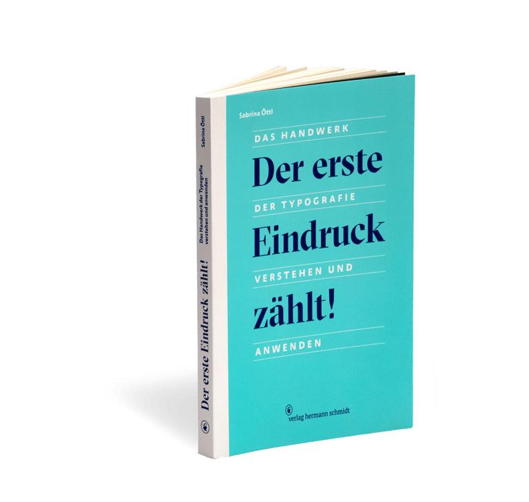
First Impressions Matter!
Understanding and Applying the Craft of Typography
160 pages
with over 100 graphics
printed throughout in two special colors (dark blue and grass-green)
size 17.2 x 24.5 cm
thread-stitched Swiss brochure with open spine
ISBN 978-3-87439-908-1
Well chosen, set and structured, letters are the most effective and easiest way of communication.
(Sabrina Öttl)