Blick ins Buch


The new thrill of writing beautifully
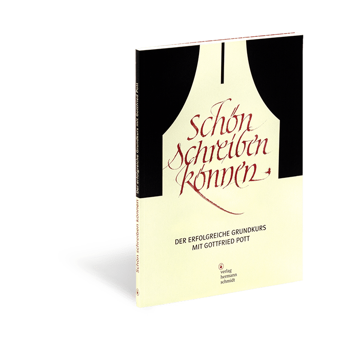
The successful beginner’s guide by Gottfried Pott
The more hand-writing disappears from the everyday life, the more valuable the handwritten becomes. Hand lettering is booming, yet only few authors are able to draw upon such profound experience as Gottfried Pott.
For more than four decades, Gottfried Pott has passed on the joy of one’s own handwriting as well as first steps into the world of calligraphy in his position as professor, lecturer, and seminar leader worldwide. He knows the hurdles and fear of the white page. He knows the search for the right form and the meaning of one’s own style. He knows typical features of characters and the nature of type, and he makes you familiar with them. He passes on the feeling for type and knowledge of layout.
With simple finger exercises he leads you to the starting line- and with valuable tips for practice and sample-alphabets guides you towards success. It is not about quick effects with him, but about sustainable experience. And it is about you finding your own style and expression.
This content sounds familiar to you?
Under the title “Calligraphy- First Aid in Type-Training,” this calligraphy training for beginners has established itself as canonical through its three editions. Thanks to that, the successful beginner’s guide now gets a new cover. And because “being able to write beautifully” has emancipated itself from the last memories of forced elementary school exercises of former centuries, this title can finally carry the name we have always wanted to give it.
The tried and tested content remains, and holds for you:
– fundamental knowledge about the nature of characters
– finger exercises for warm-up
– valuable and practical tips for beginners and advanced writers
– the most important “cliffs of calligraphy”- and how to sail around them
– more than 50 style samples and alphabet patterns for your orientation
– the most important notes on the history of writing
– colorful examples of application which inspire
It is your handwriting- make something of it!
What is the difference between hand lettering and calligraphy?
Put in simplified terms, calligraphy is the beautiful and intentional writing of words and texts, and hand lettering is the creative drawing of individual characters. Both comes alive through compositional know-how in the end. However, calligraphy works with strokes, the instrument of writing is not removed from the surface and the stream of writing ideally becomes a flow. In hand lettering, you draw individual (decorative) letters which you compose together afterwards.
Which tools do I need and what does getting in cost?
Gottfried Pott often begins his seminars with strips of Balsa wood. It is just the impracticability of this “writing tool” which results in you drawing swings in a relaxed manner with the aid of your entire body. In his book, he recommends calligraphy pens in 3.5 and 5 mm for the first finger exercises. It is only afterwards that quills and Indian ink come to play. As per usual, there are no limits, but the beginner’s tools are relatively favorably priced.
Features and design
Mastering One’s Best Handwriting – the successful beginner’s guide by Gottfried Pott
Layout: Karin Girlatschek
112 pages with hundreds of colorful images and more than 50 sample alphabets
format 22 x 31.2 cm
brochure